7 common DIY website mistakes and how to fix them
I'm a huge fan of helping small businesses build, correct or refine their own websites. In fact, bringing personality, functionality and flow to DIY websites is the majority of my client work!
This is why I build websites on platforms like Squarespace and Shopify - they're just so much easier for people unfamiliar with web design and UX (user experience) to create websites that look good, work well and are simple to update.
That being said, I've seen all sorts of web mistakes in my time working with my clients and I'd like to help you avoid some of the big hitters!
Let's get into a few ways you can fix those common DIY web errors:
1. No call to actions (CTAs)
There's no use in having content without guiding your visitors to where they can find more information or take an action that allows them to buy from you or begin a conversation with you. The easier you make it for your visitors to find the next step, the more likely they are to stay on your website and convert into paying customers!
How to fix it: Make sure that every section of content ends with a clear button that leads the customer to an action. Talking about a service you offer? End it with a button to 'Book a call now'. Introducing yourself on your homepage? Include a button inviting them to 'Read more' on your About page.
2. Not optimising for mobile
I get it, most people build their websites on a desktop, so it's no wonder that you aren't aware of how wonky it looks on mobile! The reality is, a huge number of your visitors will be visiting your site on their phone (especially if you're hot on your social media marketing).
How to fix it: Every web building platform allows you to view your website in 'mobile mode' so that you can adjust the design. Make sure your content is stacked, text is large enough to read (you don't want people having to zoom in), none of the content overlaps to the point of text being unreadable and there are no awkward empty spaces where it looks like something hasn't loaded properly!

3. Using off-putting colour combos
We all love a bit of colour, but you have to be clever with how you use it! Use your brand colours poorly and it can become an accessibility issues, putting people off of wanting to be on your website.
How to fix it: Use a free colour contrast checker like this one to see how text or objects look when paired together.
4. Not checking for broken links
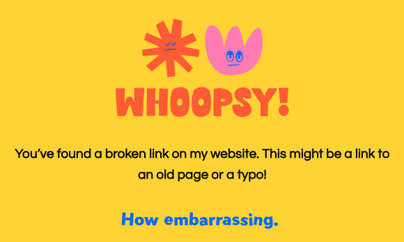
The easiest way to lose potential customers is by sending them to a link that doesn't actually work. It's just that simple!
How to fix it: Go through your website and click every button you can see (including hyperlinks) and make sure every link is going where it should! Getting friends or family to test out your site is a great way to do this as well. You can also use this broken link checker - just input your website URL and it'll show you all the pages where you have a link that doesn't work.
5. Too many popups
After being bombarded with GDPR and cookie policies, your visitors are being subjected to enough! Don't shove another popup in their face to sign up for your newsletter as soon as they visit your website. Give them a chance to actually enjoy your website first!
How to fix it: Get clever with CTAs throughout your website to avoid using loads of popups. And if you need to use one for promotional content, make it appear at least 30 seconds after landing on your page, when your visitor is about to click off or when they've scrolled down at least 50% of your page. It'll help!
6. No personality
I cannot emphasise this enough - you don't want your website to look like everyone else's! It's important your website is informative, explains what your business does and how you can help your customers. But your visitors will leave if they don't really get a good idea of who the person/business is behind the website.
How to fix it: Have fun with your branding! Here's a blog I wrote all about how you can inject more personality into your website and make it happier!
7. No information hierarchy
A big chunk of text is not inviting to read. If everything on the page is the same size, how will visitors know what to read first and which piece of info is most important? Your visitors don't have a lot of time, or attention span, to figure it out for themselves. They shouldn't have to either - it's your job to present it to them properly!
How to fix it: Make it easier for your visitors to understand what your content is about by using headings, subheadings and formatting to create a flow of information on your webpages. Think of the flow of information as a journey or a story you're telling.
Depending on where you're at in your DIY website journey, all of these mistakes can feel overwhelming to fix. It's okay! Pick one to start with and then take your time working through them all - gradual improvement is better than none at all.
Or skip the DIYing just this once by booking a Happify Day with me to fix as many of these mistakes as I can in a single day! It can really help to take all the work you've done and have a professional web designer (me!) boost your efforts.